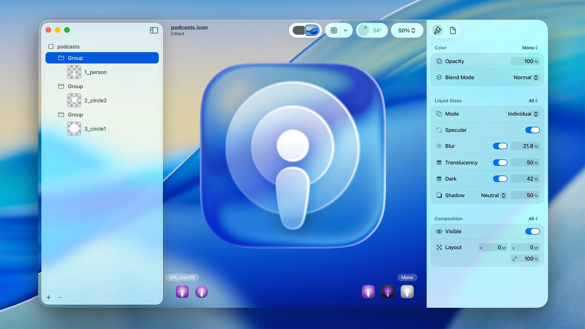
Apple Dives into Liquid Glass
iOS 26 & The Return of Transparent Aesthetics
So, Apple just dropped iOS 26, and they're pushing a whole new visual concept called Liquid Glass UI. If that name makes you think of "Glassmorphism" – that design trend bubbling up everywhere lately – you're absolutely on the right track. It feels like a direct conversation with that very aesthetic.
And you know how it goes: whenever Apple puts its stamp on a visual direction, it’s pretty much guaranteed to pop up everywhere. Seriously, expect to see this Liquid Glass vibe influencing designs far and wide in the coming months – it’s practically inevitable.
What's fascinating is where this Liquid Glass UI is drawing inspiration from. Beyond the obvious Glassmorphism connection, there's a strong whiff of the early 2000s in this look. Remember that era? It was all about transparency! Think back to gadgets like the Nintendo Game Boy Advance SP with its see-through casing, or the glossy, glassy interface of Windows Vista (launched later in the decade). It was an avalanche of see-through tech and interfaces.
When Apple embraces a visual direction, it doesn’t just trend—it transforms the landscape. iOS 26’s Liquid Glass UI isn’t just design; it’s the future echoing the translucent dreams of the early 2000s.
Honestly, it makes perfect sense. We've been seeing this major Y2K aesthetic comeback across fashion, music, and design for a while now. It was only a matter of time before those core elements – especially that love for translucency – resurfaced in our digital products and interfaces. Apple's Liquid Glass UI feels like the modern, sophisticated evolution of that early-2000s transparency obsession. It’s retro, but polished. Familiar, yet fresh.
Get ready to see a lot more glass-like layers, blurred backgrounds, and that subtle play of light and depth. The early 2000s are back, and they’re looking clearer than ever.


