
Your Homepage: The digital handshake that can make or break your business
Why Your Homepage is Your Business’ Linchpin
Picture this: a visitor lands on your site. You have 3 seconds to answer: “Why should I care?”
Your homepage is that critical handshake, elevator pitch, and storefront combined. Nail it, and you build trust. Fumble it? They’re gone. Forever.
Let’s break down exactly how to make yours unforgettable—whether you’re running a sleek one-pager or a layered multi-page site.
Your homepage isn’t just a "digital business card"—it’s a strategic storyteller. It must:
Cut through noise → 55% of visitors spend <15 seconds on a site. Be ruthlessly clear.
Build instant trust → Visitors decide if you’re credible before reading a word (visual hierarchy matters).
Guide, not dump → Like a museum curator, highlight the "must-sees" and hide the archives.
The trifecta every homepage owes visitors:
“I am [X], I help [Y] achieve [Z], and here’s [your next step].”
Fail this, and you’re leaking leads.
One-Page Website Essentials: Every Pixel Pulls Weight
(The Art of the Scroll)
When your entire site lives on one page, each section must earn its place. Think of it as a visual novel—every chapter must hook.
Non-negotiables:
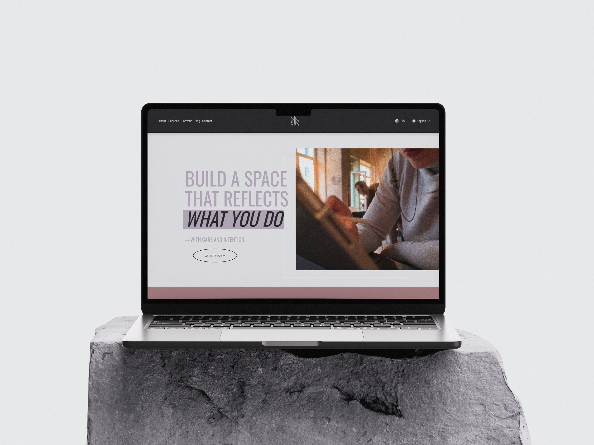
Headline with claws:
Weak: “Creative Solutions”
Strong: “Web Design That Converts Visitors for Eco-Brands.”About section ≠ your biography:
Share why you care, not your resume.“I’m Ana—a designer obsessed with turning cluttered sites into conversion machines for heart-led businesses.”
Services as headlines, not encyclopedias:
Show your top 3 offerings with icons or bold titles (details live on hover or in a modal).Social proof that stings:
Use testimonials with results:
“Increased sales by 140%” > “Great to work with!”CTA that glows:
Make it one color. One size larger than body text. Words like “Start Your Project” or “Grab Your Template.”
Flow secret: Use negative space and visual cues (like subtle arrows or fading lines) to pull the eye downward.
Full Website Homepage: Be the Ultimate Wingman
(Your Site’s “Trailer”)
A multi-page homepage isn’t a novel—it’s a teaser reel. Its job? Hint at depth, then pass the baton.
What belongs front-and-center:
Tagline with soul:
“Brand Strategy for Rule-Breakers” > “Welcome to My Creative Space!”Intro that breathes:
2 sentences max. Show personality:
“Hey rebel—I craft brands for founders who color outside the lines. (Think: punk meets profit.)”Service previews = movie posters:
Show 3-4 key services with short bullets (→ links to full pages).Freshness markers:
Feature your latest blog title (“How I Increased Client Conversions by 200%”) or new product. Proves you’re not a ghost.Navigation as GPS:
Labels like “Work”, “Process”, “Pricing” > “Stuff I Do.”
Pro tip: Place your secondary CTA (e.g., newsletter signup) in the footer—don’t fight your hero button.
Deadly Sins: Why Homepages Fail (and How to Fix Them)
(The Silent Lead-Killers)
❌ Text avalanches:
Why it kills: 95% of users scan; walls of text = bounce.
Fix: Break paragraphs at 3 lines. Use subheaders every 2-3 paragraphs.❌ Ghost CTAs:
Why it kills: Visitors won’t dig for action.
Fix: Make your CTA button contrast with your palette (e.g., coral on charcoal).❌ Mystery meat messaging:
Why it kills: If Grandma can’t grasp your work in 3 sec, you’re too vague.
Fix: Run your headline by a non-designer friend. Watch their eyes.❌ “Welcome” wilderness:
Why it kills: Generic = forgettable.
Fix: Inject specificity: “Web Design for Non-Techy Founders” > “Hello World!”
Goal-Driven Homepages: Align or Die
(Your North Star)
Your homepage must mirror your #1 business goal—like a tailored suit.
Booking clients?:
→ Headline: “Stress-Free Branding for Busy Founders”
→ CTA: “Book Your Free Brand Audit” (top-right corner + after services).Selling digital products?:
→ Headline: “Convert More Visitors—No Coding Needed”
→ Feature a product mockup with “Get the Toolkit” button.Building authority?:
→ Headline: *“The Industry Secret to 5-Figure Launches”*
→ Show logos of featured press (Forbes, Adobe) or stats (*“500+ Brands Transformed”*).
Your Secret Weapon: The Homepage Checklist
Download my free one-page checklist to audit your site (or build one from scratch). It’s battle-tested for:
One-page warriors: Flow hacks, CTA placement, and trust-building elements.
Multi-page maestros: Navigation tests, teaser tactics, and goal alignment.
Red flags: Spot and fix leaks in <10 minutes.
👉 [Download the Homepage Conversion Checklist]
Final Wisdom:
“Your homepage isn’t about you—it’s about what your visitor needs to hear to say ‘yes.’”
Polish this, and you don’t just attract eyes—you attract believers.
Stuck? I design homepages that turn visitors into clients.